Arielle Baio
Cart 0

Thrillist Maps

Thrillist started as a once daily email to NYC dwellers providing them with recommendations on the best places to eat and drink in the city. While the concept for the site was conceived and launched in NYC, the brand’s reach has grown to over 40 cities internationally. The goal for this project, is to provide a tool for Thrillist users to find recommendations as they work, vacation, and make plans with friends.

Initial Research

To get started on analysis, I worked closely with the data team to analyze user patterns on our site. We paid particular attention to the sources of our traffic, what our traffic was mostly looking to find, and what types of devices they were using to visit our site. In addition to on site data analysis, we surveyed our users directly to get their feedback on our venue offerings and used that data to help inform our project MVP and designs. 

Once I'd compiled enough data to understand how our users were currently accessing our venue recommendations, I compiled a few deliverables to help visualize my findings.

This user flow maps out how users were initially accessing our venue content and connects it with a potential mapping experience.


Integration Points

Another key consideration point for the product, was other potential funnels from the Thrillist site experience to the new maps product. I outlined and documented all of those considerations as well to ensure that all entry routes were considered in the design.

This chart helped me organize all the integration points I'd need to consider in the design.


Wireframes

My first step in thinking about the actual interface for the product, was to start sketching out a few possibilities. When putting together the initial sketches I focused on basic screen layout and functionality that I wanted to include in the MVP. A few of the excerpts below are possible mobile screen options for the product.

Simple Sketches

Far left: On sketch showing a mobile screen mostly comprised of a map with a venue card on the bottom of the screen. Middle: A simple navigation with exposed map pins. Far right: An information based interface focused on displaying venue recommendat…

Far left: On sketch showing a mobile screen mostly comprised of a map with a venue card on the bottom of the screen. Middle: A simple navigation with exposed map pins. Far right: An information based interface focused on displaying venue recommendations with a smaller area for the location information.

A few simplified desktop sketches show some of my initial thoughts around the desktop map interface and its filtering options.

A few simplified desktop sketches show some of my initial thoughts around the desktop map interface and its filtering options.

Detailed Wireframes

The next step in my process involved mapping out specific details within the interface. This excerpt from my wireframes shows the main components of the mobile map experience in it's early form.

The next step in my process involved mapping out specific details within the interface. This excerpt from my wireframes shows the main components of the mobile map experience in it's early form.

Detailed Desktop Wireframes

Prototypes

There were several design iterations before we reached our final design for launch. In order to determine if a design was effective, we’d often prototype a piece of the experience and run a quick user testing session. Below is one design we were considering that eventually got updated to look more like the experience you’ll see live on the site today.
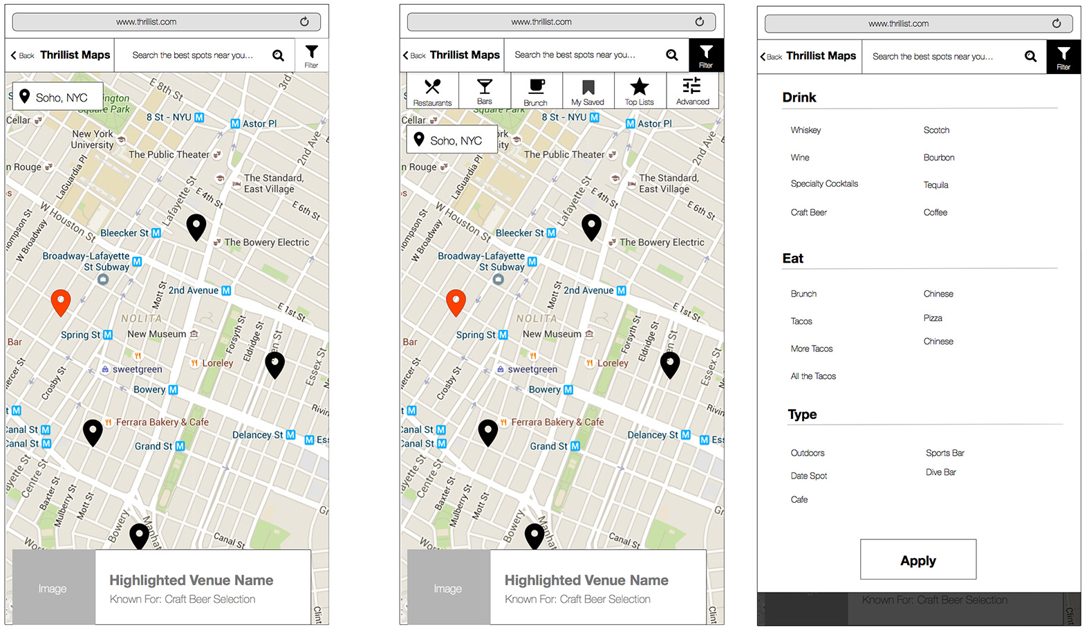


Visual Design

Once the wireframes were finalized and circulated to our internal and external stakeholder teams, we began to formally design the interface for the product. Through the mobile designs we finalized ad placement, final filters, and an expanded venue card displaying details for a specific location.

Conclusion

Thrillist Maps product officially launched to the public in the Fall of 2016. We are continually testing and iterating on the product. Visit it live on Thrillist.com/maps.

maps.png


Thrillist Navigation Redesign

As one of my first assignments at Thrillist, I was tasked with redesigning the global navigation for both desktop and mobile experiences. The new navigation needed to support an ever growing and evolving breadth of content, placement for advertisement, provide access to sub level navigation categories on interior pages, and maximize screen real estate for certain desktop and smaller screen sizes.

For this project, I was the Senior User Experience Designer working primarily with the Technology and Design teams to craft a new navigation experience for Thrillist users and advertisers.


Research & Audit Existing Experience

To kick off the project, I completed an audit of the current navigation experience. This helps me understand the current structure and hierarchy of the content, current functionally that may need to be ported over to the new experience, and pain points in the experience that need to be adjusted. The standard desktop navigation took up a lot of room at the top of the screen.  It had two bars of links, content, search, and shopping utilities. There are also a lot of conflicting paths to partner sites, e-commerce, social, and acquisition modules.

This is a capture of the old Thrillist Navigation.

This is a capture of the old Thrillist Navigation.

Cities Dropdown

The city dropdown is confusing and combines a lot of closely spaced text with images. While interviewing users, some reported that the images for the top four cities felt like column headers which makes it harder specific city of interest. Often they would ignore the top four city pictures and look in the list of cities. 

Screen capture of the previous cities drop down.

Screen capture of the previous cities drop down.

Mobile

The mobile navigation had several major pitfalls. It provided only one level of access to content and was only available on top level page content and not articles. This greatly reduced user engagement and exploration. There weren’t active or selected states for any of the items. Tapping the cities item launched a native picker which users needed to scroll through all 44 markets to find a specific locality to view.

The image above shows Thrillist's previous mobile navigation menu.

The image above shows Thrillist's previous mobile navigation menu.

Analytics

I also worked with our data team to understand how our current users engage with the navigation by traffic source. I learned that the navigation is not a widely used convention for our social users. They mostly recirculate through the experience through related links and modules. Organic search users are twice as likely to engage with the navigation, they are mostly looking for cities. Mobile users are even less likely to engage with the navigation. They prefer to use site search to find specific content.


Desktop Wireframes

This is a streamlined wireframe of the main navigation bar. To simplify the experience, I’ve removed the black branding bar with external links and ad bug. I’ve also removed the global social tools, since they provide little utility in navigating the site. In order to accommodate an ever changing list of content sections, I’ve added a “More Sections” menu item. I worked with tech to ensure that items could regularly rotate out of top level navigation and into the drawer on a seasonal or priority based schedule.

Cities Drop Down

I reorganized the city dropdown to make the content feel a little less overwhelming to our users. Top cities are grouped in the left hand corner of the menu and called out with images. A complete city list is just to the right of the top city call out.

Cities Sub Menu

When a user visits a city page, a sub menu will help them navigation themes within the section.

Mobile Wireframes

For the mobile experience, I decided to openly display the two levels of content to remove an additional tap option between first and second level navigation items. Top level navigation items on on the left side of the mobile screen and represented by icons. Tapping an icon shows the secondary level menu to the right. I’ve also incorporated a search field in the new experience to address our initial findings that mobile users are most likely to search our site.

Tapping on a city expands the navigation item to show all of it's secondary navigation items.

Tapping on a city expands the navigation item to show all of it's secondary navigation items.

The "sections" of the site don't have sub navigation items, so tapping on them takes the user directly to the landing page.

The "sections" of the site don't have sub navigation items, so tapping on them takes the user directly to the landing page.


Design

The main navigation visual design was able to save about 40 pixels of space on the desktop experience. The example below, shows our solution for ad placement within the main navigation bar. 

During visual design, we reorganized the menu to include the drop downs in the same area of the navigation.

During visual design, we reorganized the menu to include the drop downs in the same area of the navigation.

We also have a scrolled state for the navigation bar, that allows us to maximize space for our users to view all the great content Thrillist has to offer.

We also have a scrolled state for the navigation bar, that allows us to maximize space for our users to view all the great content Thrillist has to offer.

This design shows our final design for the very content heavy city navigation dropdown. We’ve kept our top four cities called out in the left hand side of the navigation dropdown. Since users read from left to right, this increases the chances our u…

This design shows our final design for the very content heavy city navigation dropdown. We’ve kept our top four cities called out in the left hand side of the navigation dropdown. Since users read from left to right, this increases the chances our users will find the city they are interested in finding. This also breaks up the visual field and allows users to scan the list of additional cities to the right.

The individual city navigation sticks to the main navigation and allows users to browse city sub-sections.

The individual city navigation sticks to the main navigation and allows users to browse city sub-sections.

Each Thrillist section has a brand color. This shows the active states for the nav when users click into an article in the Technology section of Thrillist.

Each Thrillist section has a brand color. This shows the active states for the nav when users click into an article in the Technology section of Thrillist.

Mobile Designs

Screen Shot 2021-03-30 at 6.39.10 PM.png

The two screens above show our final mobile navigation designs. During design and development, we decided to add a fun transition to the menu by rolling it out in levels on tap. Otherwise, we remained pretty close to the original wireframes for the design.

The redesigned navigation rolled out early 2016. You can check it out live on Thrillist.com!

 
iPhone_6_plus_perspective-Gold.png

 Introduction

In November 2016, Thrillist Media Group merged with several other prominent web content publishing companies; The Dodo, Seeker, and Now This. The group of new brands formed a new group called Group Nine Media. Under the new Group Nine umbrella, my team and I have had the amazing opportunity to redesign each website experience to unify the Group Nine brand. The following outlines all the research, findings, and concepts for the Seeker website redesign.

Audit of Existing Site

Our first step of the project, was to audit the existing site and determine the requirements for the new site experience. During this time, we also tried to identify any potential conflicts and new functionality that may need to be built in order to accommodate Seeker editorial initiatives. Below is a screen shot of their original homepage. In order to successfully migrate it over to the Group Nine platform, we'd need to adjust the grid, ad model, fonts and content hierarchy.

seeker.png

First Steps: Create a Universal Grid System. 

In order to successfully support the Seeker brand and it's content on the Group Nine platform, we needed to insure that the design grid systems for each site experience could support the content publishing needs for each brand. We started with Thrillist's grid and asset sizes (shown below) and then completed an audit of Seeker, it's content and ad placements, to map out a basic grid for the site experience.

click to expand!

Brand Colors 

Before the redesign, Seeker had one brand color ( the berry color on the far left). We wanted a brand color on each section of the site to help orient users throughout the site experience. We devised a complimentary color scheme to help users interested in a specific section and subject matter to be able to quickly identify related content.


Homepage Wireframes

We started working on the homepage of the site to help determine the general information architecture of the website. Below is a capture of the new basic layout of the page and how it corresponds to our universal grid.

Content Strategy

Below is a capture of the complete set of mobile wireframes for the Seeker homepage experience. Users viewing the homepage are looking for an an overview of the brand and it's content. For this reason, we decided to place the newest trending content near the top of the page and then structure the rest of the page into breakouts for each sub section of Seeker. To give the page hierarchy, we broke the page with full width images for each section and added the section tags and colors to add visual interest and organization to the page.

Click to expand.

Visual Design

Below are some captures from the visual design artifacts for the site. Enjoy!

Seeker.png

Introduction

SFO is the largest airport in the San Francisco Bay Area and the second busiest in California, after Los Angeles International Airport. In 2013, it was the seventh busiest in the United States and the twenty-first busiest airport in the world by passenger count. It is the fifth largest hub for United Airlines and functions as United’s primary transpacific gateway. It also serves as Virgin America’s principal base of operations. It is the sole maintenance hub of United Airlines, and houses the Louis A. Turpen Aviation Museum.

In late 2012, my firm was hired to redesign and develop the flysfo.com experience for San Francisco International Airport. I worked as principal User Experience Designer for this project and guided it through several processes from initial intake of the project, through development and its launch, as well as, regular maintenance and feature updates post launch.


MVP

With millions of users accessing their website regularly, SFO needed an updated look and an upgrade on some key user features to assist in the day to day functions of the airport and it’s website users. In particular, they were looking to upgrade their flight status, amenities listings, mapping components, improved social integration and a mobile optimized site for airport visitors.


Step 1: Discovery

With our strategy team, I worked to understand the user and technical requirements for the new website experience. We conducted in depth stakeholder interviews with several key members of the airport’s Board of Trustees, their Director of Communications, and other key staff. We combined the stakeholder feedback with a comprehensive content audit of the entire site and an overall analysis of the site’s structure. Key findings from these steps were funneled into our next project phase. A few screens below outline portions of this process.

Research

Figure 1: (Left)During the content audit for flysfo.com, we realized there were many inconsistent paths at varying navigation levels to content on the SFO site. In the image above we worked to map out this content and reorganize it into a consistent navigation pattern.

Figure 2: (Right)During the stakeholder interviews for flysfo.com, we combined feedback from across the many airport interviewees to create a list of personas. The image above outlines one piece of our user persona process

Site Audit

After we investigated our user groups, wrote personas, and finalized requirements, our next step was to audit key areas on the site that provided core functionality to airport visitors. A few of those areas were the homepage, navigation, and the flight status pages (shown below).


UX & Strategy

In this phase of the project, I was part of a cross functional team that included a Development Lead, Project Manager and a Strategist. Together, we worked with the client principally on determining the new experience of the site. How it would flow, how and where content would be rearranged, and how existing functionality on the site could be upgraded. To do this we worked from sketches through to wireframes that mapped out the new experience. A few excerpts are shown below.

This initial wireframe depicting the homepage experience begins to map out how users visiting the site can access information important to them in the most expeditious manner. There’s a nod to the new navigation structure and links to important port…

This initial wireframe depicting the homepage experience begins to map out how users visiting the site can access information important to them in the most expeditious manner. There’s a nod to the new navigation structure and links to important portions of the site including, Flight Information, Alerts and Advisories, Ground Transportation, and Navigating the Airport

Figure 6: A key feature for flysfo.com is the flight information section of the site.This initial starts to combine important search functions for users, such as, an open text field for searching and filtering options for results.

Figure 6: A key feature for flysfo.com is the flight information section of the site.This initial starts to combine important search functions for users, such as, an open text field for searching and filtering options for results.

For mobile users, we took a different approach for homepage and navigation structure. Mobile users needed a more direct path to important site functions. We experimented with icons and buttons that highlighted top areas on the site. These top areas …

For mobile users, we took a different approach for homepage and navigation structure. Mobile users needed a more direct path to important site functions. We experimented with icons and buttons that highlighted top areas on the site. These top areas were determined by analytics tracking on the site, and internal feedback from Airport stakeholders.We worked through a few rounds of functional combinations through sketches and wireframes. This image was an option for full menu navigation extending from the side in a drawer-like fashion.

User Testing

Throughout the wireframing process, we worked with UTest to user test iterations of the wireframes. We wanted to ensure that the layouts and functionality would translate to both local and international travelers. This resulted in a few tweaks to the initial ux design.


Design

Once the wireframes accurately mapped out the site structure and information architecture, we moved into the design phase where we determined the look and feel for the new experience. Below are some of the final results screens.

The new homepage for flysfo.com successfully combines large clean imagery with all the key functional components clearly visible for users visiting the site. ** Not Shown** There is also a special advisory and alerts feature that allows the airport to communicate emergency flight delays, weather warnings and other information to visiting users.

The new flight info page for flysfo.com clearly highlights the flight status search bar. Users can use the “Search Flights” field to keyword search for their flight using flight number, airline name, airline code, time for departure or arrival. We also included a second line of filtering options to help refine any search. Additionally, this new search doesn’t require a the page to reload. It searches in real time as a user types or applies filters. This greatly minimizes user frustration when they’ve applied one too many filters on a search and allows for them to access results in a more efficient manner.

Mobile Designs

Figure 10: The final layout for mobile screens can accommodate many screen sizes. The menu is laid out in stages so users can navigate successfully through the many levels of information on the SFO site.

Figure 10: The final layout for mobile screens can accommodate many screen sizes. The menu is laid out in stages so users can navigate successfully through the many levels of information on the SFO site.


Results

The outline above only represents a small sampling of the work completed for the FlySFO.com website redesign. To view the site in action, visit the actual site here.

Post launch, the site earned many awards including:

2013

Best in Class, Museum Website — Interactive Media Awards

2014

Gold Winner, Government Websites — W3 Awards
Gold Winner, Online Travel Services — Magellan Awards
First Place – Websites (Traditional) for the re-launched flysfo.com — Airports Council International–North America (ACI-NA)
Best in Class, flysfo Website — Interactive Media AwardsTM

SFO_INCOMPUTER1.jpg