Thrillist Maps
Thrillist started as a once daily email to NYC dwellers providing them with recommendations on the best places to eat and drink in the city. While the concept for the site was conceived and launched in NYC, the brand’s reach has grown to over 40 cities internationally. The goal for this project, is to provide a tool for Thrillist users to find recommendations as they work, vacation, and make plans with friends.
Initial Research
To get started on analysis, I worked closely with the data team to analyze user patterns on our site. We paid particular attention to the sources of our traffic, what our traffic was mostly looking to find, and what types of devices they were using to visit our site. In addition to on site data analysis, we surveyed our users directly to get their feedback on our venue offerings and used that data to help inform our project MVP and designs.
Once I'd compiled enough data to understand how our users were currently accessing our venue recommendations, I compiled a few deliverables to help visualize my findings.
This user flow maps out how users were initially accessing our venue content and connects it with a potential mapping experience.
Integration Points
Another key consideration point for the product, was other potential funnels from the Thrillist site experience to the new maps product. I outlined and documented all of those considerations as well to ensure that all entry routes were considered in the design.
This chart helped me organize all the integration points I'd need to consider in the design.
Wireframes
My first step in thinking about the actual interface for the product, was to start sketching out a few possibilities. When putting together the initial sketches I focused on basic screen layout and functionality that I wanted to include in the MVP. A few of the excerpts below are possible mobile screen options for the product.
Simple Sketches
Far left: On sketch showing a mobile screen mostly comprised of a map with a venue card on the bottom of the screen. Middle: A simple navigation with exposed map pins. Far right: An information based interface focused on displaying venue recommendations with a smaller area for the location information.
A few simplified desktop sketches show some of my initial thoughts around the desktop map interface and its filtering options.
Detailed Wireframes
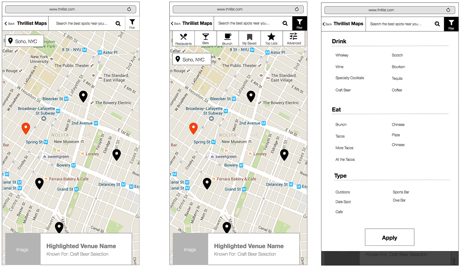
The next step in my process involved mapping out specific details within the interface. This excerpt from my wireframes shows the main components of the mobile map experience in it's early form.
Detailed Desktop Wireframes
Prototypes
There were several design iterations before we reached our final design for launch. In order to determine if a design was effective, we’d often prototype a piece of the experience and run a quick user testing session. Below is one design we were considering that eventually got updated to look more like the experience you’ll see live on the site today.
Visual Design
Once the wireframes were finalized and circulated to our internal and external stakeholder teams, we began to formally design the interface for the product. Through the mobile designs we finalized ad placement, final filters, and an expanded venue card displaying details for a specific location.
Conclusion
Thrillist Maps product officially launched to the public in the Fall of 2016. We are continually testing and iterating on the product. Visit it live on Thrillist.com/maps.


